TRUA TEA: Unveiling Purity and Authenticity
Logotype, Packaging
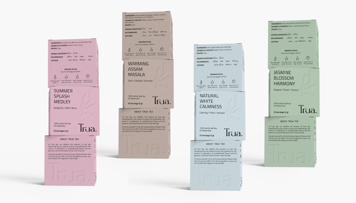
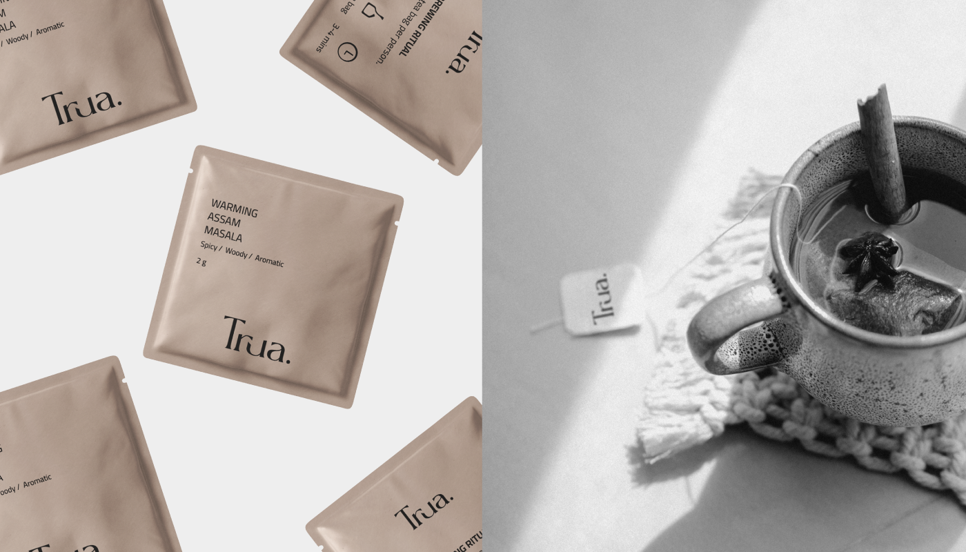
Trua Tea brand redefine the essence of true tea, embracing the core values of purity and authenticity. Sourced from pristine landscapes, their teas embody the untarnished purity that nature intended.
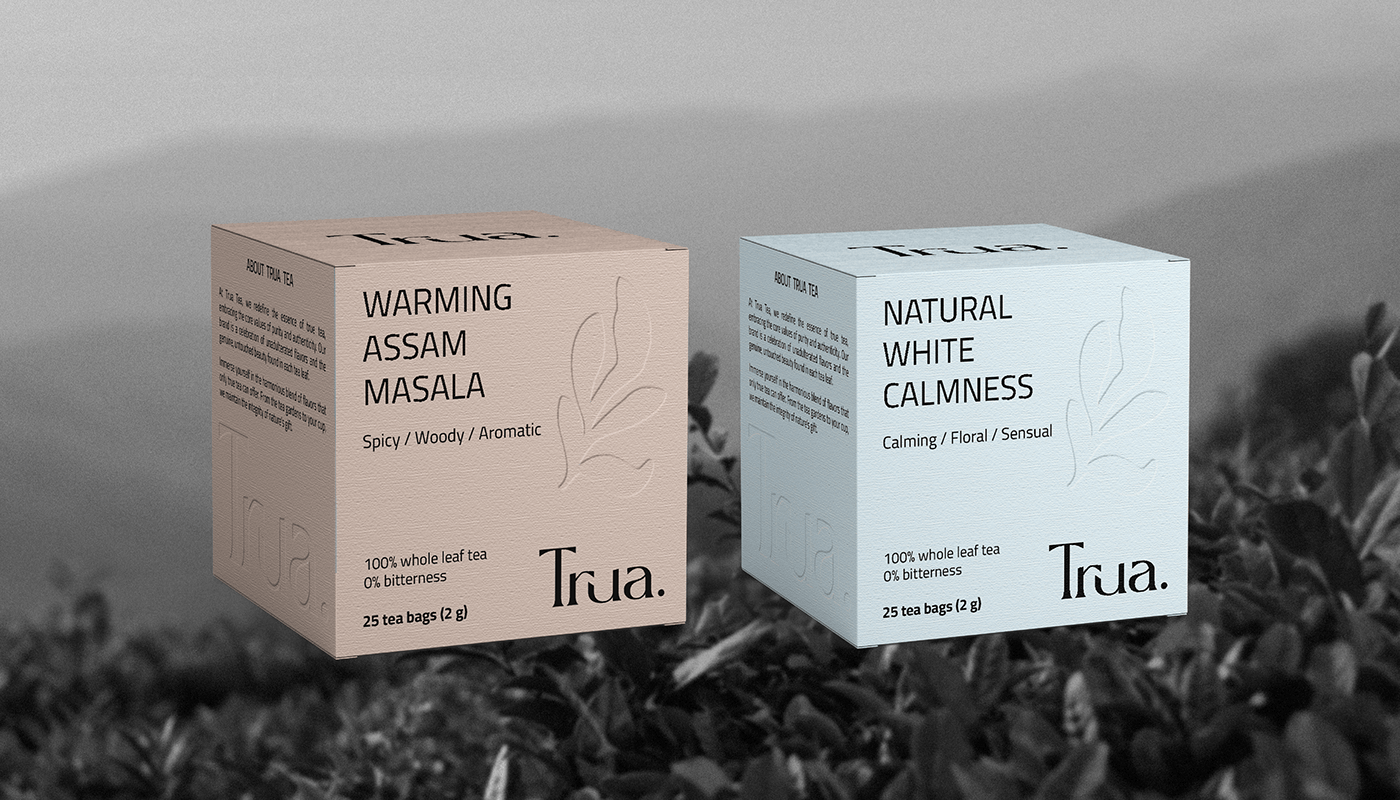
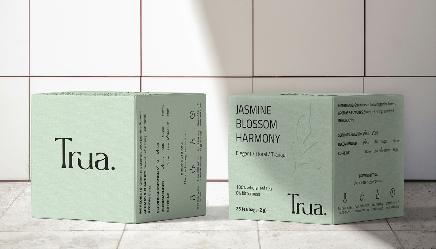
Trua: This word is an analogue of the English "true", indicating purity and naturalness. To accentuate its ethos of natural purity, Trua endeavors to craft a visual identity and minimal packaging design which reflect the origin of true tea.
Solution: The logo is designed in a text format, without unnecessary details and direct references to the tea brand. The colour palette includes simple shades that are associated with taste of tea. The box design is clear and is perceived as environmentally friendly and extremely natural.The natural textures and delicate embossing incorporated into Trua’s minimal packaging capture the verdant harmony of untainted nature that the brand’s organic teas intrinsically reflect.